
Overview
This paper is intended to consider the purpose and use of data dashboards in the context of (mainly) public sector business insight and intelligence. It will do this by working through the following four sections:
- Firstly, it will try to consolidate what is commonly meant by a dashboard;
- Secondly, it will examine what the UK public sector wants from a dashboard;
- Thirdly it will look at a number of examples which draw together and highlight these requirements, each with a small commentary.
- Finally, it will try to consider how SDA/GIDE might be able to benefit from further work on embedding dashboards into our work and products.
_______________________________________
Part 1: Background
What do we mean by a dashboard?
The word dashboard originally referred to a piece of wood or leather, used to protect the driver of a horse-drawn carriage from the mud and pebbles flung up by their horses’ hooves. When the original motor vehicles were built, the same principle – and name – was applied to the panel keeping the fumes and heat of the engine at bay. As cars evolved, so did the dashboard, to enable the driver to monitor their vehicle’s major functions at a glance via a centralised instrument cluster.
This description is precisely suited to its use today: the ‘data dashboard’. Essentially it is a graphical user interface providing snapshot views of key performance indicators relevant to particular objectives or processes. It may, for example, show the number and types of crimes being solved in a policing jurisdiction according to their priority. Or it may show the progress towards a particular strategic outcome by reference to a number of component outputs. The key point is that it directly draws on the most recent data available within an organisation and that it can be compared with earlier snapshots to provide a sense of trajectory.
Who uses dashboards?
Not data people! They can run whatever sophisticated queries they need.
I would suggest that data dashboards are a reporting console rather than a data tool. I would further suggest that they are – and should be – designed for and aimed at managers to understand the business status of their organisation, or the part of it they control, by monitoring the specified performance of those units that report to them.
Why would they use them?
To gauge exactly how well an organization is performing overall, the corporate data dashboards should enable each manager to easily view a periodic snapshot of strategically or operationally relevant data, from each of the units they control, to provide a snapshot of how they are performing against their stated contribution to the ‘corporate mission’.
To achieve this the data needs to be:
- suitable tiered to enable a common dashboard to be deployed at all relevant levels, and
- properly categorised according to the strategic or operational component it is intended to describe. This will allow the corporate dashboard to contain modules that can be swapped in or out depending on their relevance to the manager using it.
What are the benefits of using data dashboards?
- Visual presentation of performance measures
- Ability to identify and correct negative trends
- Measure efficiencies/inefficiencies
- Ability to generate detailed reports showing new trends
- Ability to make more informed decisions based on collected business intelligence
- Align strategies and organisational goals by focusing on responsibilities
- Provides total and instant visibility of all relevant components
- Saves time compared to running bespoke reports
- Quick identification of data outliers and correlations.
_______________________________________
Part 2: How does the UK Public Sector use dashboards?
The Government Digital Service has, for better or worse, rightly focused on the use of timely and accurate data to understand gaps in policy, underpin new or corrective policy and to monitor its implementation. It is, as they say, ‘on a journey’. Having said that, GDS have come a long way in articulating the problems and along with the Office for National Statistics and the Government Statistical Service, are beginning to define the issues and produce solutions.
Here are some extracts from an ONS blog discussing the strides being made in using data dashboards to corral and present complex data from across the public sector (it’s worth reading in its entirety):
“Each year the ONS and government departments publish data which provide insight into the efficiency of public services. When these datasets are viewed separately, however, it can be hard to understand the bigger picture. Now the interactive dashboards which aim to bring together a range of data in one place.” – Sophie Davis, headline para from the blog.
“With more data available than ever before, a dashboard can be a great way to analyse and present data quickly, in an interactive and accessible format.” – from the blog.
“There is real value in this work; bringing data together to cut through the noise and make sense of the world around us.” – John Pullinger, National Statistician.
These, and other, observations from around the public sector demonstrate that there is a growing appetite for data dashboards to focus on and illuminate the key data that drives progress.
Demos: Governance by Dashboard
Of course, there are other commentators who present a more cautionary view of their use. In their Demos paper “Governance by Dashboard”, Jamie Bartlett and Nathaniel Tkacz summarise their emergence during the 2012 Coalition Government’s early days:
“In late 2012, the Government Digital Service created a new way for the Prime Minister to keep on top of events. Around the Cabinet Office, it was known as the ‘Number 10 Dashboard’. This bespoke iPad app provided performance indicators on a number of government services, real-time information on aspects of the economy, trends from social media and expert commentary, all integrated into a single screen and with the capacity to ‘drill down’ as needed.”
They go on to describe five contingent features of data dashboards that have emerged as they have developed. These features are contingent because, they argue, “…how they present this data, and how it is acted upon, in turn creates new modes of behaviour, attitudes and norms within the organisations that use them.” All or any of which may be beneficial, or not. These features are:
- ‘Increased focus on data and measurement’, which they broadly support
- Introduction of ‘New biases’, which can be summarised as the story being shaped by the choice and presentation of the data
- ‘Design’, which, they remark “has profound consequences in shaping the priorities of its user, and dashboard designers should be acutely sensitive to the agency of a dashboard’s architecture in shaping the meaning that the dashboard’s user gleans from its interface.”
- ‘New types of knowledge’ in which they comment that “Dashboards perpetuate (the) tendency to show things as they are (and are related) but without any attempt to explain why.”
- ‘New forms of expertise’ in which they comment that “dashboards are the tool that communicates the work of data scientists, designers, developers, information architects and other technical experts to people whose expertise lies elsewhere.” They caution that this potentially skews the relative values of the producers and the users (who are usually the ‘doers’) to the disadvantage of the latter – and therefore the organisation!
The paper ends with four recommendations:
- Clarity of purpose: City leaders said they needed a ‘city dashboard’. “There may have been good reasons for requesting a dashboard, but these had not been effectively communicated to the team assembled to build it. The team had access to any number of data flows, from real time car parking, transport and social media ‘sentiment’ data, to public utilities data, but without a clear sense of what the dashboard was for it was very difficult to make concrete decisions about what to include.” QED!
- Users: In this, the authors converge with the GDS’ view that the dashboard MUST be guided by what the operational and/or policymaking users require of it, whilst acknowledging that that is sometimes easier said than done.
- Danger of ‘off the shelf’: In which the authors look at the pros and cons of bespoke vs off the shelf. On the whole they conclude that the choice is down to ‘horses for courses’, however they do end on a note which may be interesting for SDA: “It is worth mentioning, however, that increasingly even bespoke dashboards incorporate pre-existing software. There are a number of open source software and free visualisation tools that are commonly used for lowscale dashboard design.” Perhaps we should investigate.
- Understanding limitations: Here the authors offer a clear ‘caveat emptor’: “Since many dashboards are explicitly made to manage organisational performance, some commercial dashboards can reproduce a ‘performance bias’. That is, the dashboard can pull your data as well as the actions of a team in a specific direction. Finally, once integrated into an organisation, dashboard metrics and KPIs can be gamed like any other rule or metric. For all these reasons, users should foster a critical disposition toward their dashboards, and constantly remind themselves of the dashboard’s limits.”
You can find the full paper here.
_______________________________________
Part 3: Examples of data dashboards in use in the UK public sector
Here we will look at three examples of UK data dashboards, including a group of beta presentations from Government Statistical Service, and (rather counter-intuitively) one educational dashboard from California, to look at what can be done and how they are used. All of them are public facing and therefore easy to explore. By and large the narrative will be delivered through images of the dashboards themselves. Though I will explain transitions and what can be gleaned from the displays.
This is a very basic dashboard, summarising sentiment in a selection of ten categories, presumably regarded as key by Ofsted leaders. These categories abstract the results from their component questions, which number around 100 in all, some with several sub-sections. They also show the change in sentiment from the previous survey and, to provide a broad-brush comparison with the wider context, a comparison with the same categories in the civil service as a whole as well as a comparison with so-called ‘Civil Service high performers’.
Leaders would quickly glean from this a) that the trajectory is broadly positive b) that they outpace the civil service as a whole, sometimes by a considerable margin, and c) they also often outpace the civil service at the high end of their comparison groups.
The presentation of this information therefore obeys the basic tenet of a dashboard: to meaningfully present key information to decision-makers whilst retaining the necessary data for analysts and policy makers to examine as necessary.
Clearly this form of dashboard is essentially static and, though very useful in its own terms, does not connect to the data it presents and is therefore inflexible.
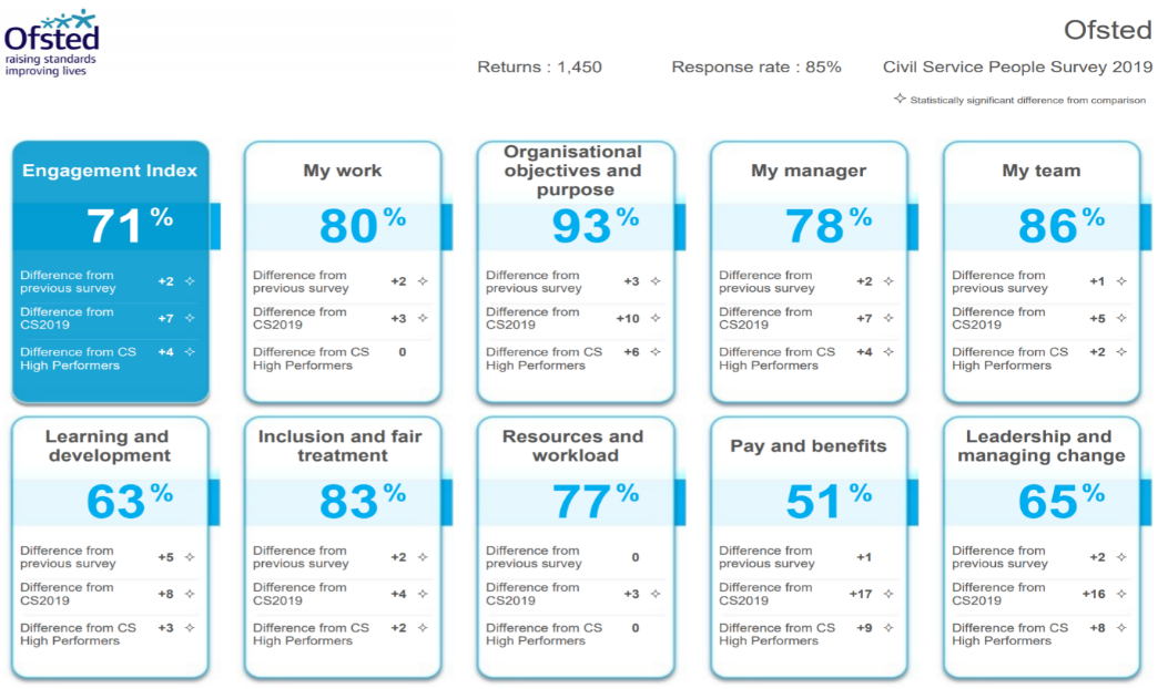
Ofsted people survey dashboard
2) Mayor’s Office for Policing and Crime (MOPAC) Weapon-enabled crime dashboard
This is one of a range of similar dashboards which together compare and chart 12 month rolling crime data across London. It has been specifically designed and compiled to reflect local priorities, and therefore seems to conform to the Demos recommendations 1 (Clarity of Purpose) and 2 (User oriented).
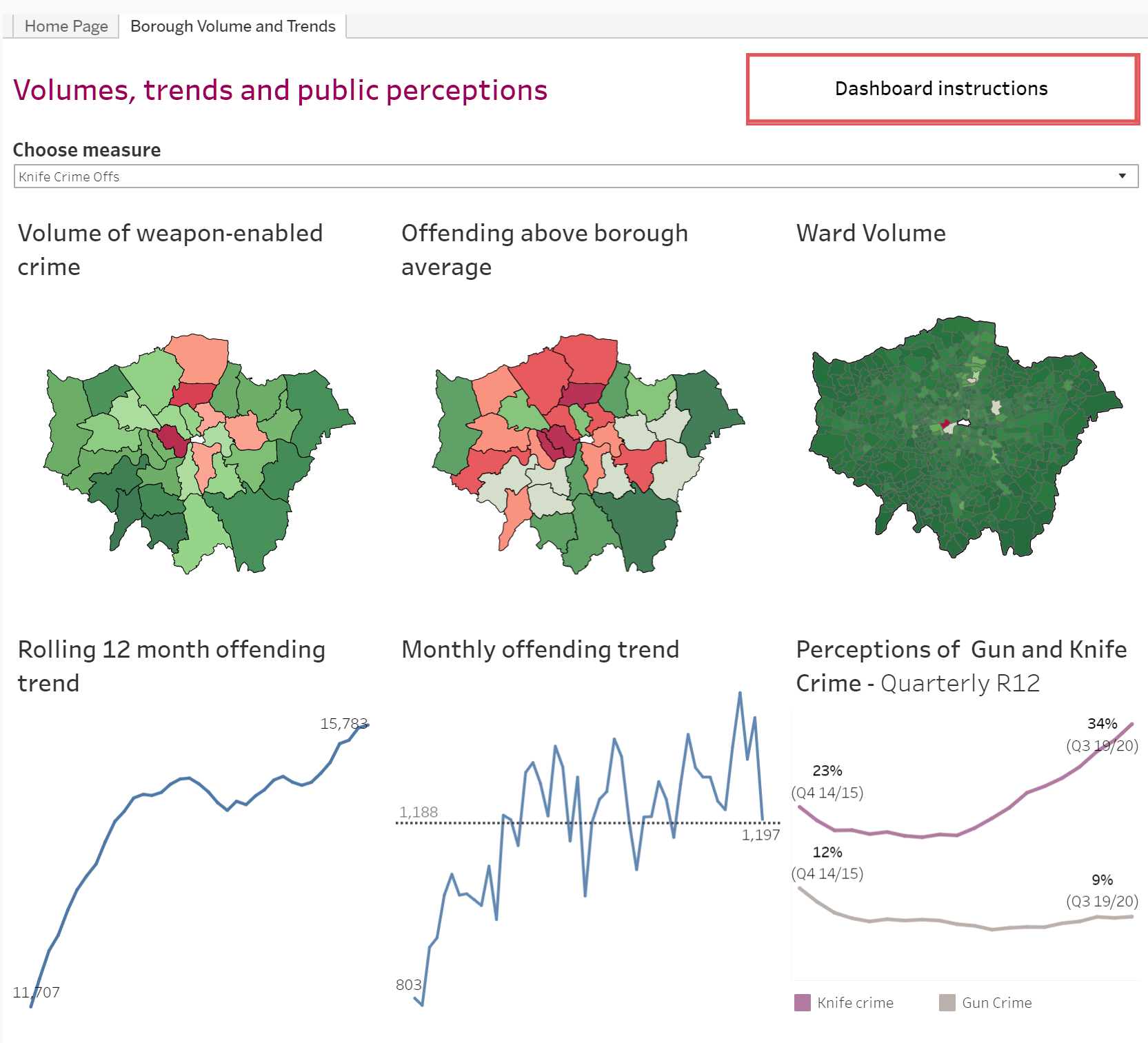
The weapons-enabled crime dashboard is configurable to provide the user with the ability to ‘chase down’ their specific enquiries by providing a) filters to interrogate specific forms of weapons-enabled crime and b ) the ability to drill down to borough and ward level for specific data, which can then be selected to view or download using point and click. It also provides a longitudinal view, by quarter, showing public sentiment about the type of crime being explored.
The following images illustrate these and other facilities available with this dashboard.
A) Dashboard description
B) Dashboard overview
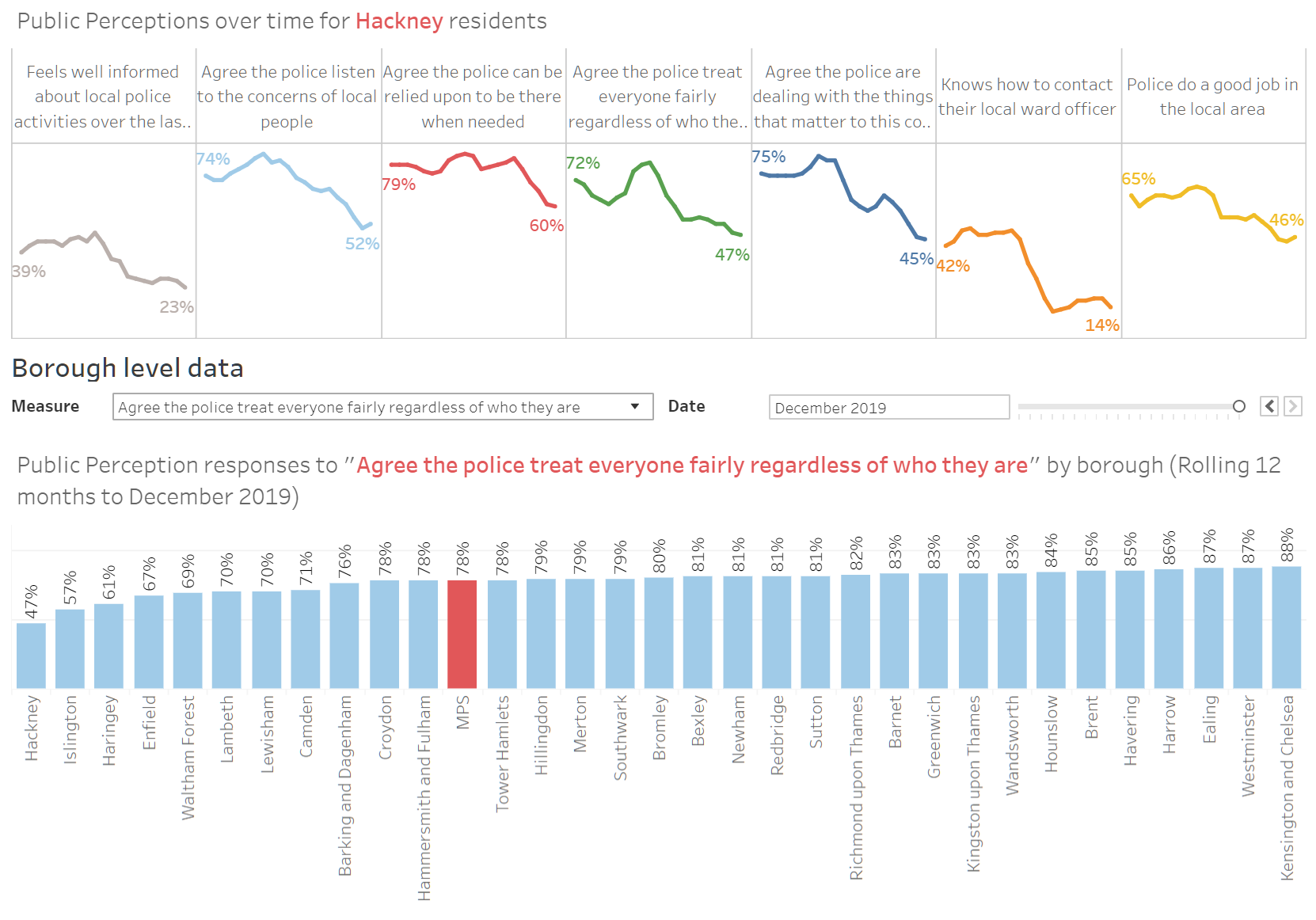
Here, the user can gather at-a-glance information, across the Metropolitan Police jurisdiction, about any given weapons enabled offence (filtered in this case for knife crime) including colour coded gradations demonstrating hotspots against the mean, and longitudinal measures over different periods.
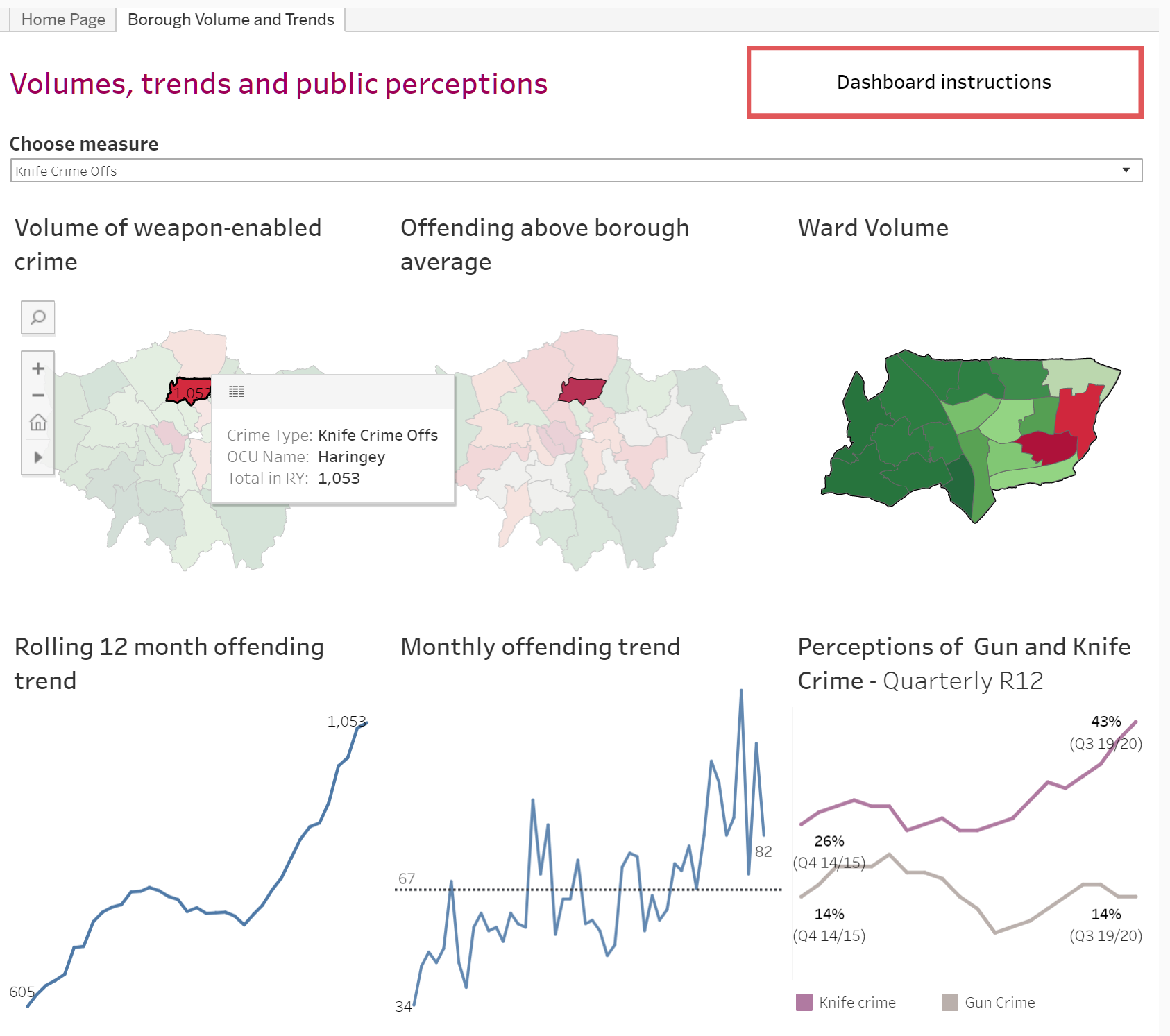
C) Data and trends by borough and ward
Here you can drill down to specific boroughs and their wards. The longitudinal measures are adjusted accordingly.
D) Public perceptions by borough, over time (Hackney selected)
Finally, in this brief glance, a look at borough comparisons for public perceptions across a range of reference questions:
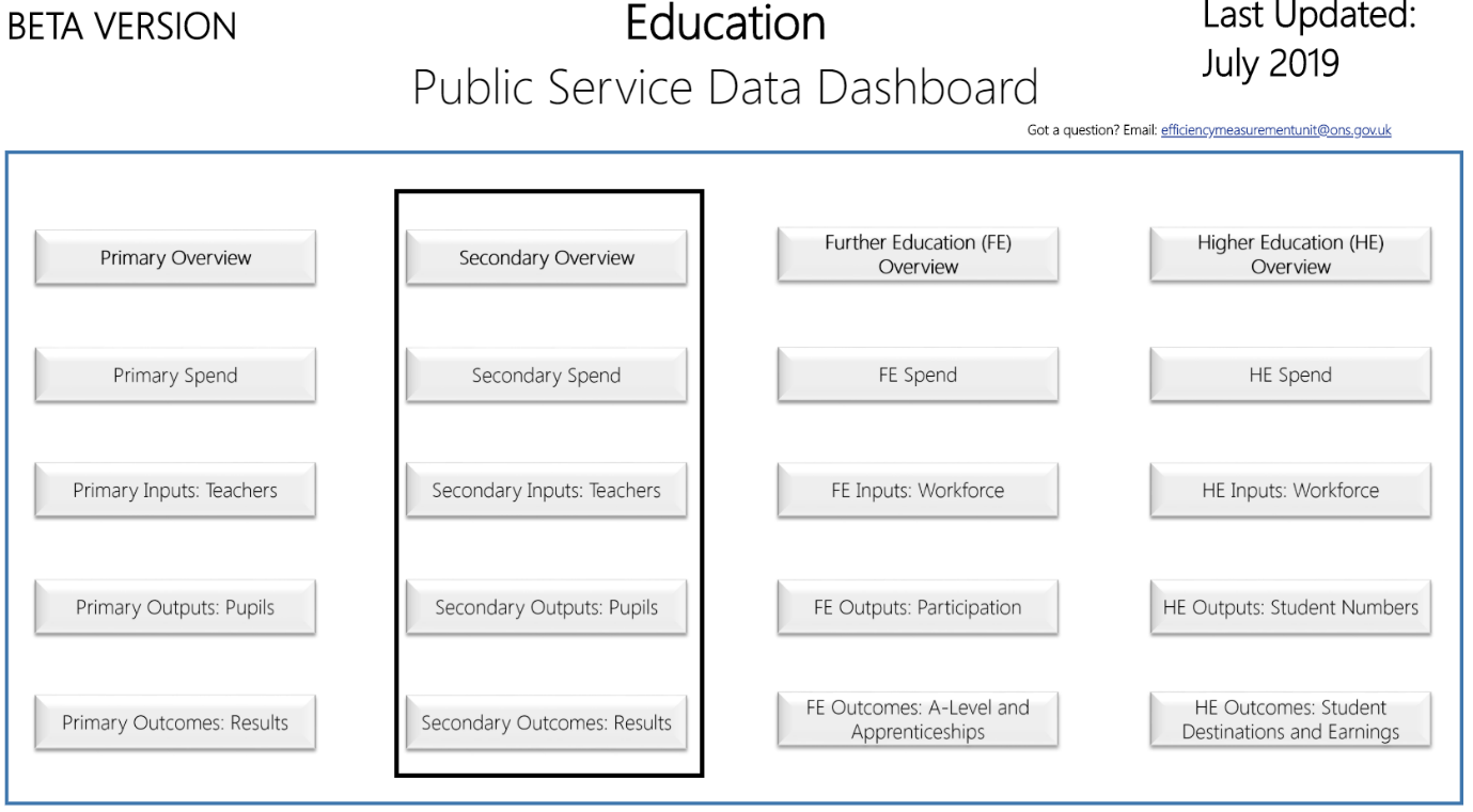
3) Government Statistical Service Public Service Data Dashboards (Beta)
This set of four comprehensive data dashboards, covering Criminal Justice, Education, Health Care and Work and Pensions, perhaps go furthest in demonstrating the public sector’s intention to integrate their respective data sets. They draw on a broad range of existing National and Official Statistics as well as published management information, bringing them together into an interactive tool under the efficiency headings. By doing so they intend to illuminate, and thereby build a wider understanding of, public sector efficiency.
We will take a quick look at what they describe in Education.
N.B: These are efficiency measures and deal exclusively with overall input/output data. School level performance and financial data remain available through the usual channels.
A) All education sectors. We will further examine the ‘Secondary’ views.
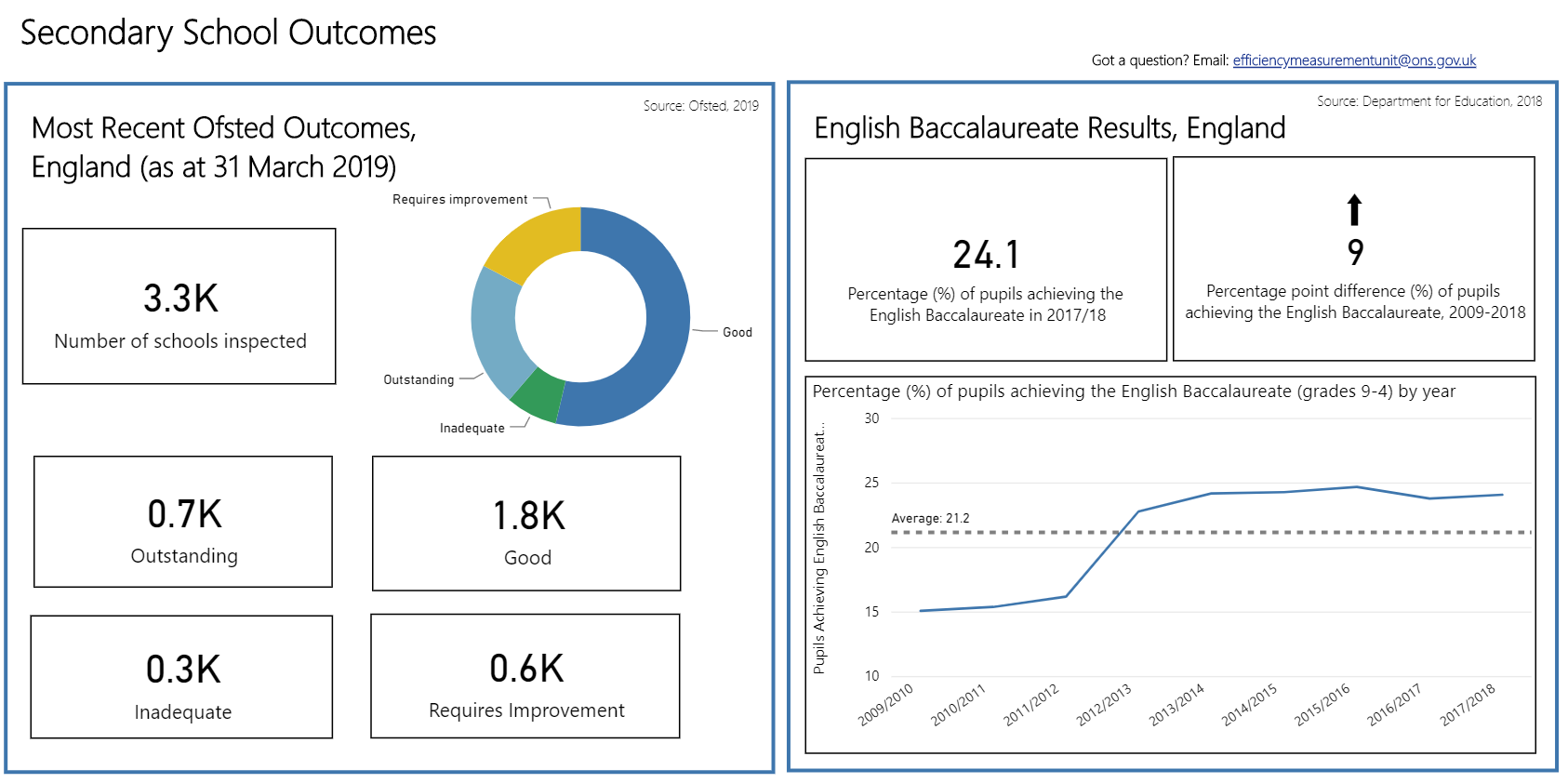
B) Secondary Overview: as implied, drilling down to this panel provides a broad overview of the following four categories, each of which can be interrogated to the extent of their annual summary over time. After briefly considering this overview, we will take a further look at the overall ‘input’ (spend) and the outcomes derived from it.
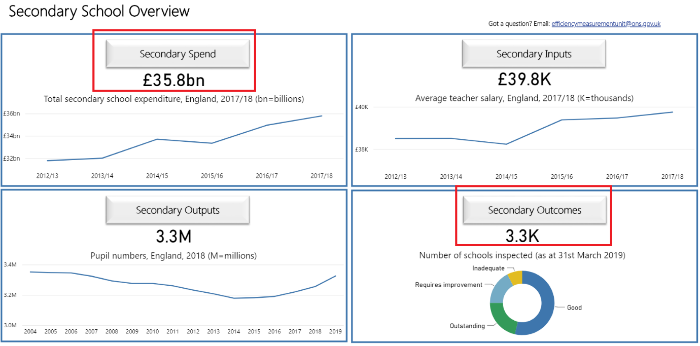
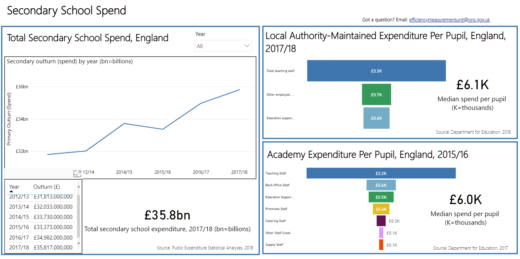
C) Secondary Spend: this shows headline expenditure/annum (gross input) and an in-year breakdown and comparison of secondary spend/pupil in LA maintained schools against Academies.
D) Secondary outcomes: finally we can examine headline outcomes (according to HMG priorities), noting that, while the spend panel distinguishes between LA maintained and Academies, the outcomes panel does not, focussing instead on the outcomes for the English Baccalaureate. This could, presumably, be replaced by a more meaningful comparison assuming the data is available.
4) A view from the United States: The California School Dashboard
This is an eye-pleasing, customer focused operational dashboard clearly showing their key performance indicators which can be broken down according to a number of demographic and performance categories by state, school district and school/institution.
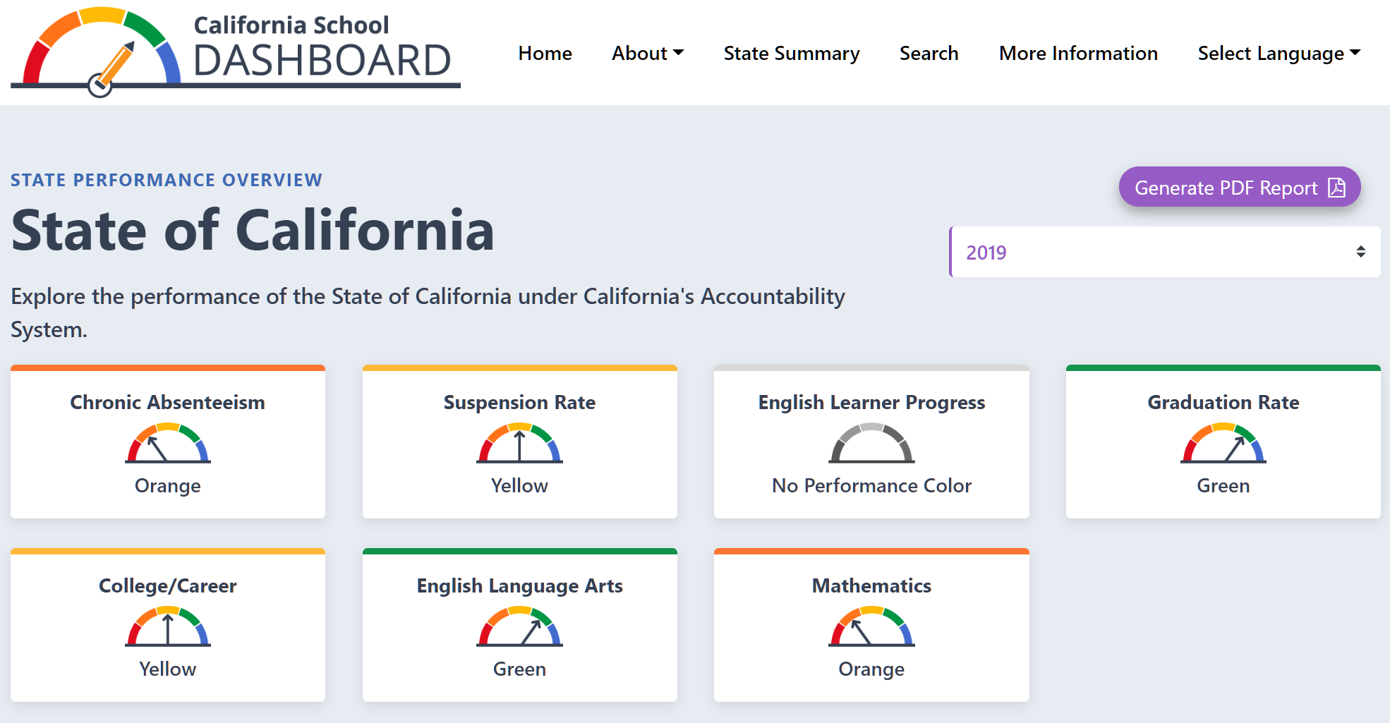 (Note also that a PDF report can be downloaded)
So for example, let’s explore the ‘Mathematics’ performance indicator, which shows that statewide performance in maths is in the ‘orange zone’ generically labelled ‘low’ performing, but more precisely defined (in the detail) as being “33.5 points below standard based on student performance either on the Smarter Balanced Summative Assessment or the California Alternate Assessment, which is taken annually by students in grades 3–8 and grade 11.”
This is a good example of providing a broad brush visual assessment without losing the underlying meaning for more refined analyses.
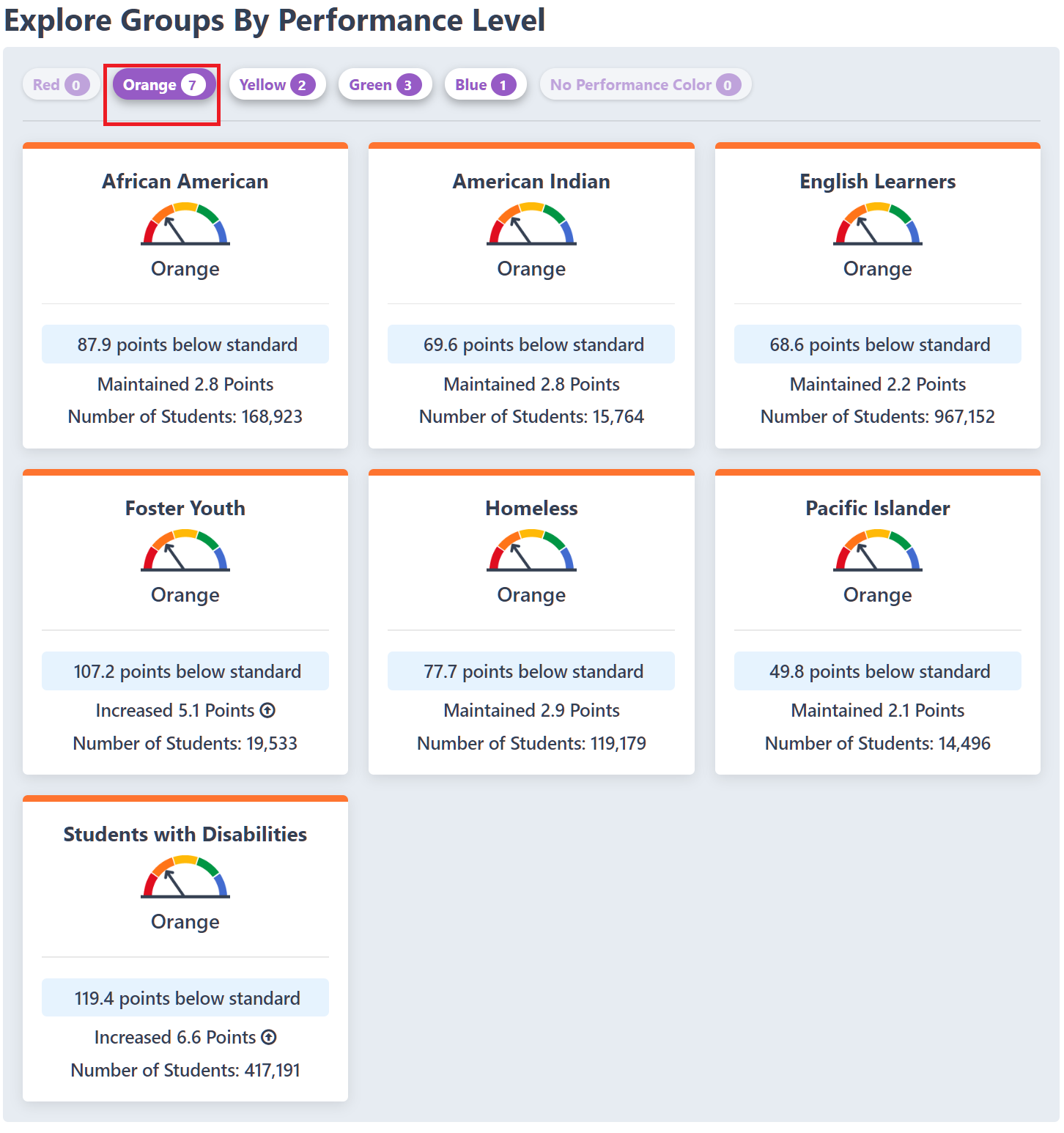
The mathematics performance indicator can be further examined to identify how ethnic and socio-economic groups perform:
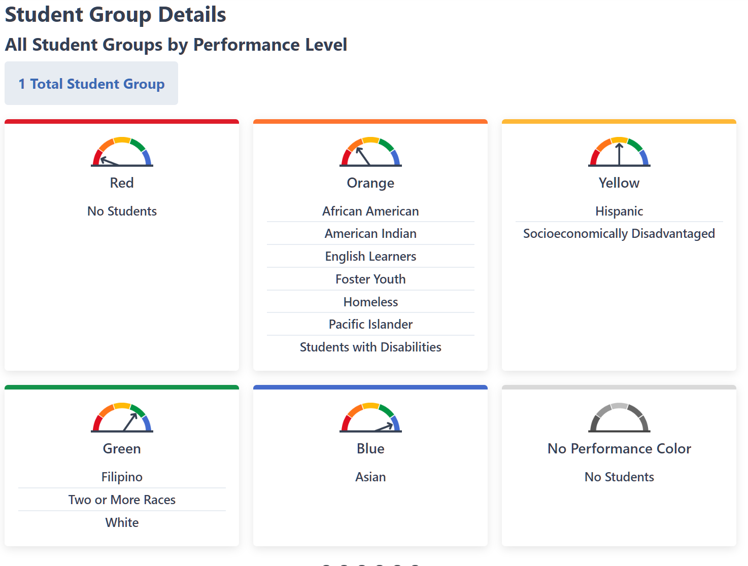
Finally, more precise information can be found about the respective performance of ethnic and socioeconomic groups, in this example the ‘orange’ category, it having the largest representation:
_______________________________________
Part 4: Takeaways for SDA/GIDE.
Dashboards: there are a lot of them about. It’s hard to tell whether they’re a fad or whether they’re here to stay. To some extent that may come down to their utility: there are clearly occasions when they, or their representations in reports and presentations, do absolutely nothing to illuminate the data they try to convey. Just look up “bad data dashboards” on google for a truly scary array of how to do it wrong.
On the other hand, a meaningful set of data – a data dashboard in other words – that has been developed to represent the important metrics valued and used by an organisation, running off good data that has been well described, can cut through the noise to deliver clarity and insight.
The examples we have examined conform more or less (according to taste) to this requirement:
- A tool for presenting progress towards strategic objectives (Ofsted)
- Tracking operational performance against tactical goals (MOPAC)
- Gathering together and making sense of large and disparate data-sets (GSS Beta)
- Providing simple and intuitive information for a range of consumers to help guide or focus their choices (California).
Having considered this research – especially the very useful Demos report – I think that Robert Baldy (SDA CEO) is right: each dashboard that we (or anyone) might create needs to be a bespoke project, tailored to the requirements of the given client. I might go further: we should test what it is that the client wants to do with the dashboard to ensure that their objectives are deliverable, and that the product will provide them with the results they (think they) want. On their behalf, we should be clear that the data they are collecting, or have collected, is sufficient – and sufficiently good – to achieve their ends. To some extent this would enable us to leverage what we claim to be our core talent: organising and processing data.
We should therefore take to heart the Demos recommendations, that the dashboard project or development should:
- Identify purpose and use: In and of themselves, Dashboards are not necessarily the best way to understand all problems, and must be carefully considered to ensure they meet organisational needs. Once the purpose has been identified, it must be communicated clearly to its designers as well as its intended users.
- Understand limitations: Dashboards will often prioritise operational issues, rather than longer-term strategic issues, and may marginalise more reflexive approaches to a problem. Like all metrics they can be “gamed”, and so users must be encouraged to have a critical eye for the dashboard’s limits.
- Select the right staff and skills: Just because they are designed to be user-friendly, it is dangerous to assume users will intuitively understand how to use them. To maximise the take-up rate among staff, they will need to be provided with training to understand the dashboard’s purpose, where the data is drawn from and the way that it is framed.